FinTech Company
NDA

About project
This project focused on redesigning a private enterprise CRM system used for managing financial operations, deals, reports, client records, and installment plans.
After completing the full CRM redesign, I was responsible for translating the product into a mobile application — not as a copy of the web version, but as a rethought, mobile-first tool for field employees and managers who work on the go.
The challenge: turn a large, table-heavy financial system into a clean, structured, touch-friendly mobile experience without losing functionality.
Business Goals
- Increase operational efficiency by simplifying daily flows in CRM.
- Reduce errors in finance and deal processing through clearer UI and structured steps.
- Enable mobility for managers and agents working outside the office.
Responsibilities
Benchmarking
Hypothesis building
Wireframes
UX/UI Design
Interviewed internal users
Prototyping
Target Audience


Maria, 34
Finance Manager
I work with payment schedules and installment plans every day.
If something is unclear, I risk making a financial mistake.

Michael, 45
Head of Sales
I’m constantly on the move.
I need a mobile app where I can review and approve deals quickly — without horizontal scrolling.

Emily, 38
Administrator
I manage client records, documents, and statuses every day.
If screens are cluttered, it slows down everything I do.
HYPOTHESES

Working hypothesis
→ Quick access to client information
When I am in the deals table, I want to be able to open client information by clicking, so that I can quickly find the necessary information.
→ Active row improves focus
When I am using the table, I want to highlight a row (make it active by clicking) so that I don’t lose track of the data I am currently working with
→ Frequent filters speed up search
IWhen I am looking for a specific deal in the table, I want to see frequently used filters to apply them quickly.
→ Focused sidebar reduces distraction
When I am searching for a specific section in the sidebar, I want to avoid distractions from “secondary” sections, so that I can quickly find the “main” ones.
Non-working hypothesis
When I open the main screen, I want to see a task list to quickly complete them and not miss any important tasks.
→ Task list on the main screen is unnecessary
When I click on reports or especially on references in the sidebar, I want the further items to be displayed in a more understandable view, so that I can quickly understand where I want to go next.
→ Sidebar expansion does not add clarity
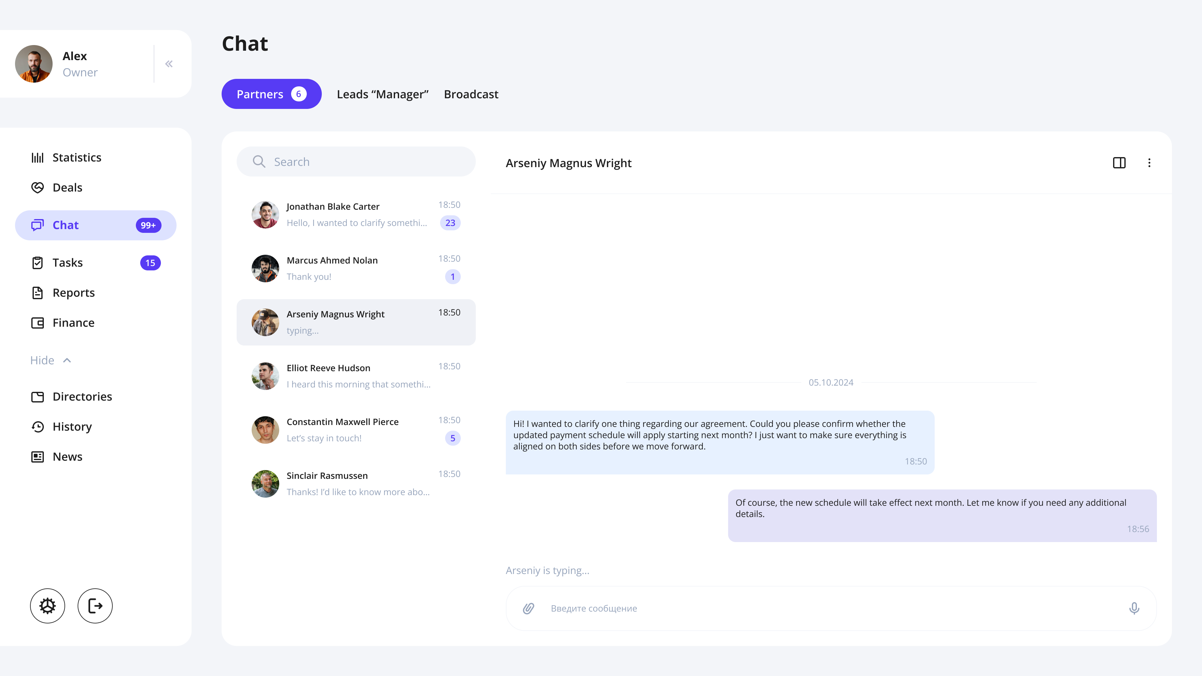
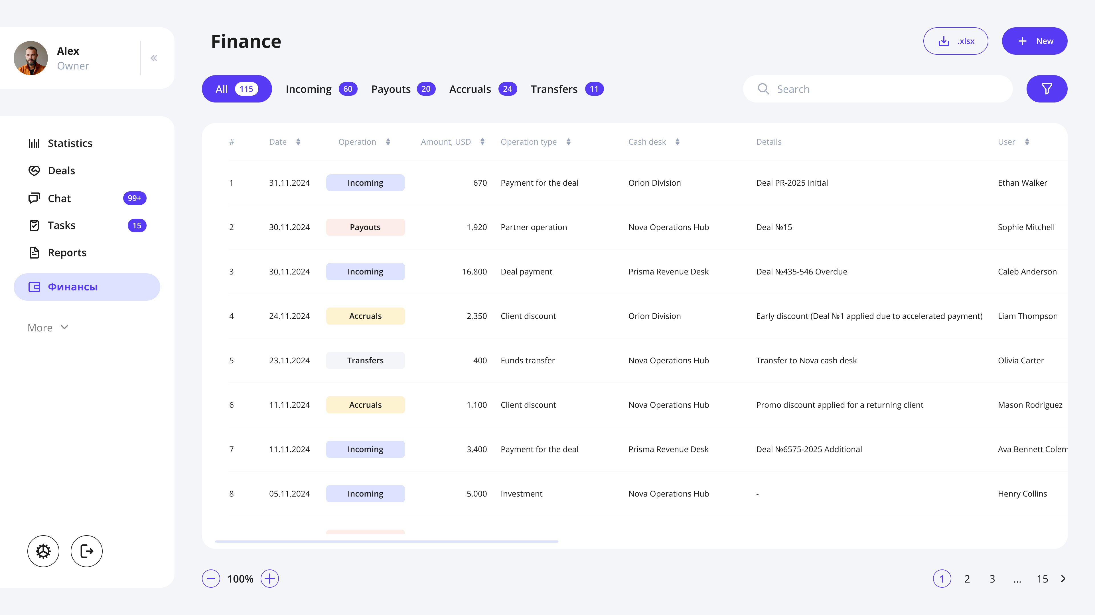
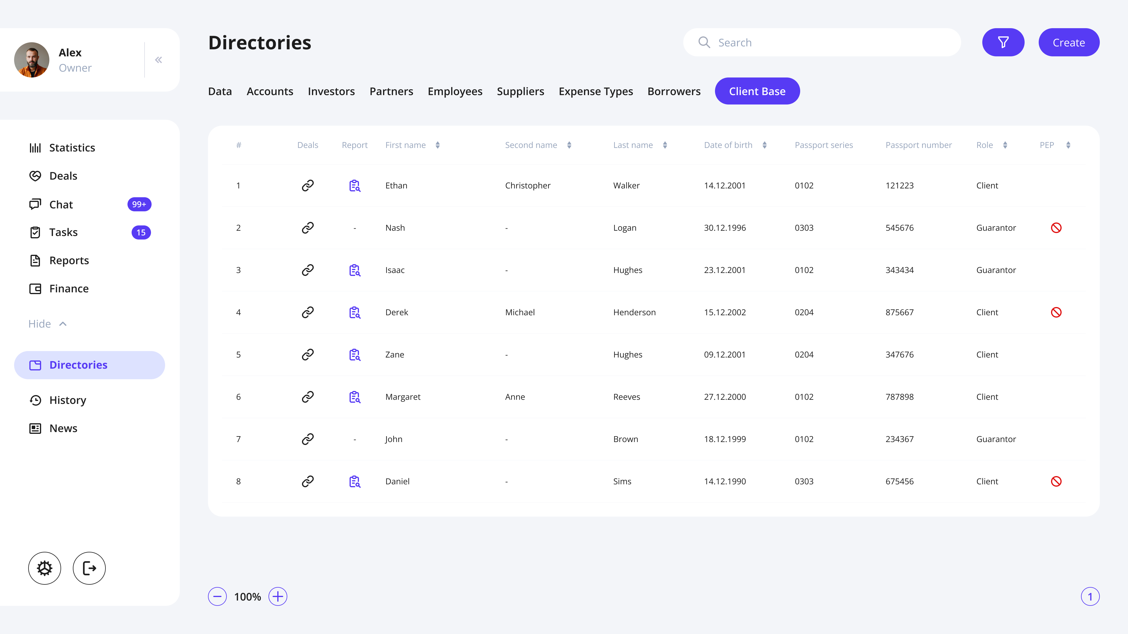
CRM redesign

Problem
The original CRM suffered from visual overload: inconsistent layouts, dense tables, unclear hierarchy, and a lack of structure across financial screens.
The team needed a fresh, clean financial UI that would reduce cognitive load and bring predictability to daily workflows.
Solution
Based on interviews with existing CRM users, I identified key friction points in navigation, financial flows, and data readability.
The redesign focused on:
- lean, modern UI with clear hierarchy
- consistent patterns for deals, payments, and installment plans
- streamlined flows (fewer steps, clearer logic)
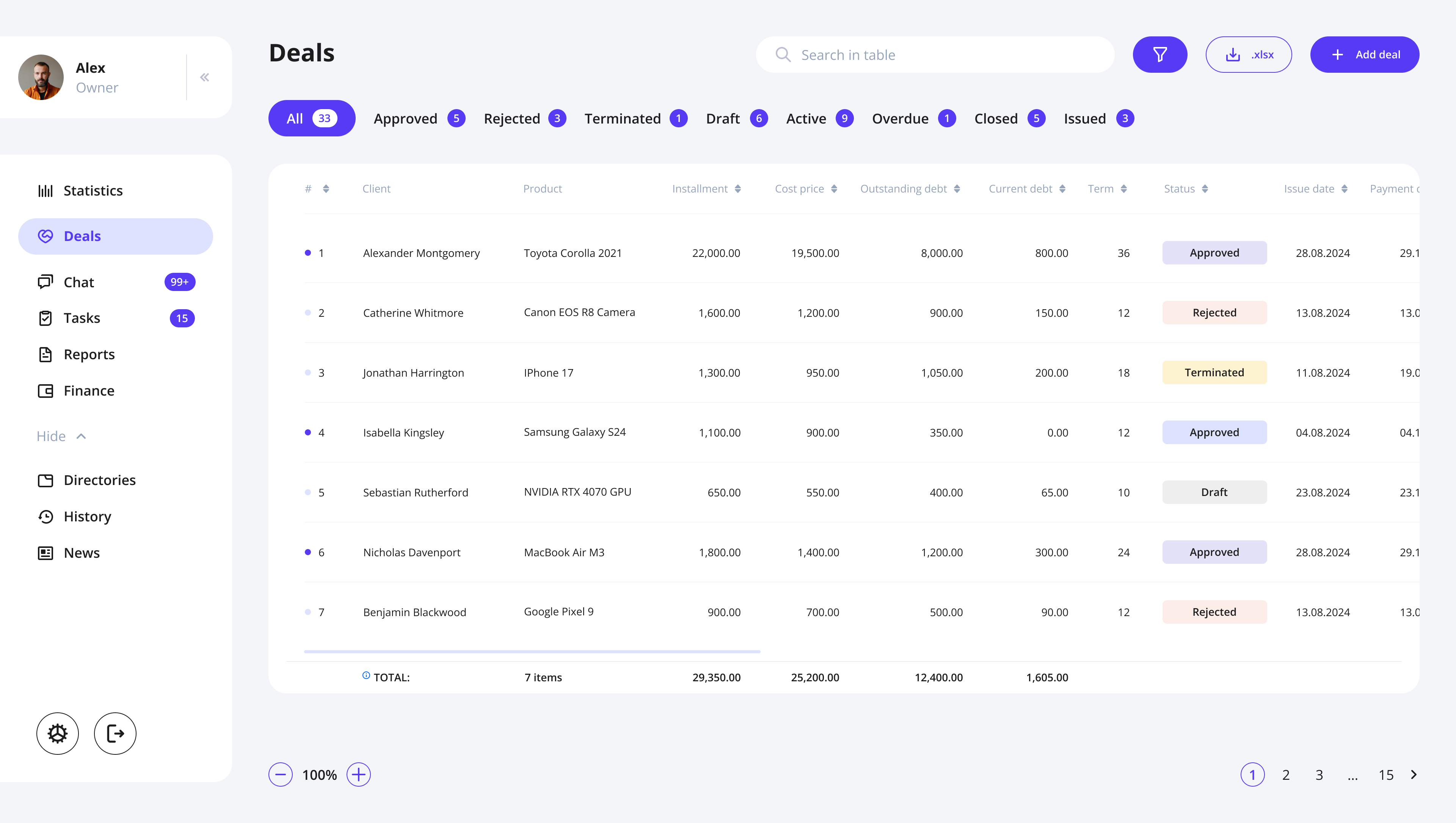
The Result
The redesign transformed the CRM into a clean, high-clarity financial system that feels modern, reliable, and truly built for professionals.
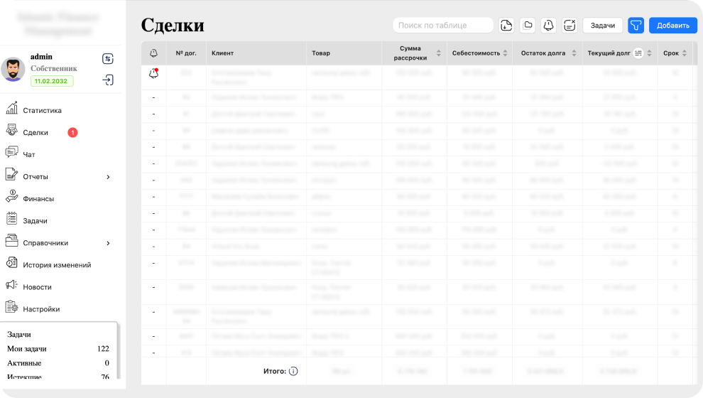
Old to New // Example

Screens // Examples
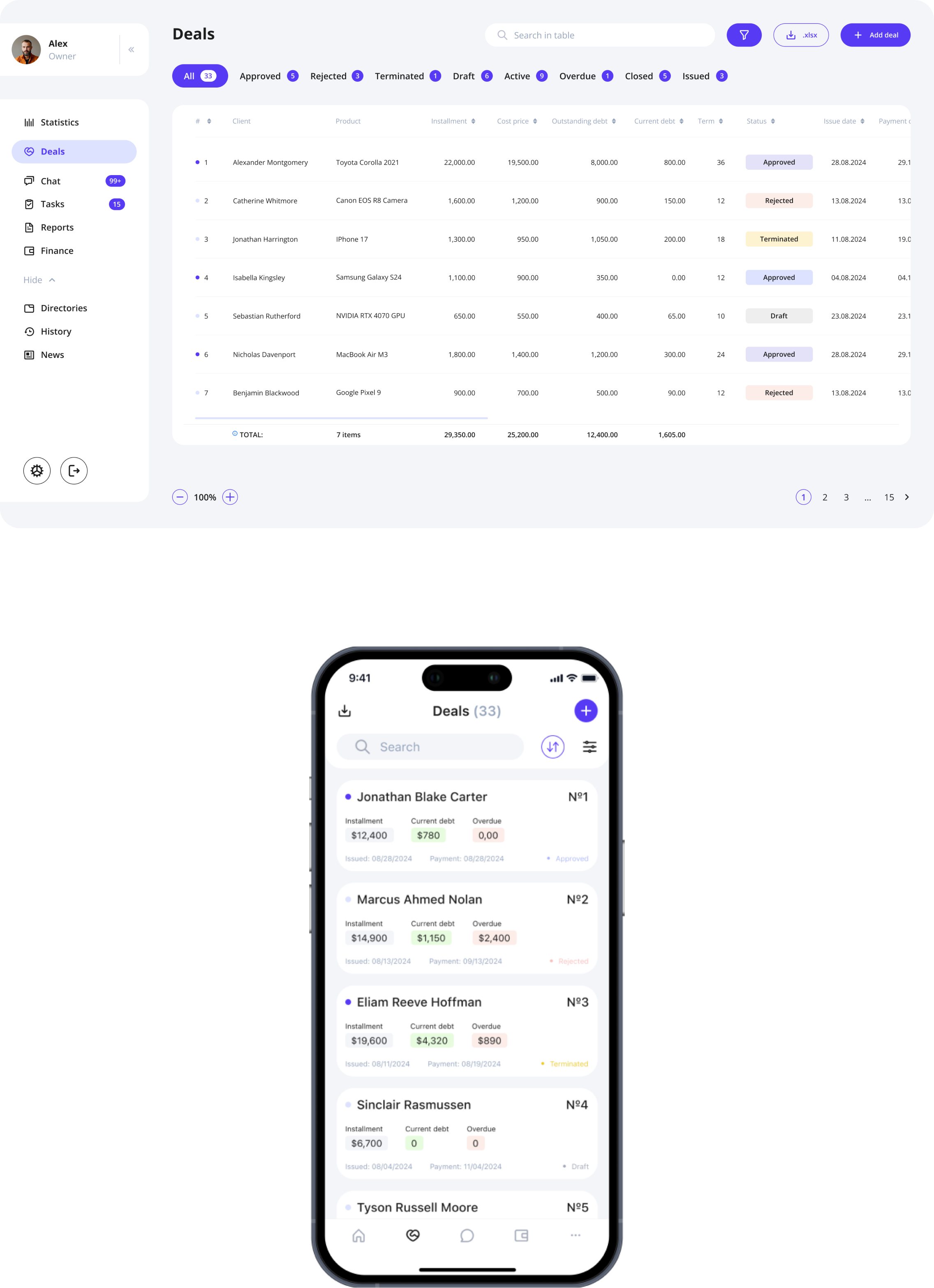
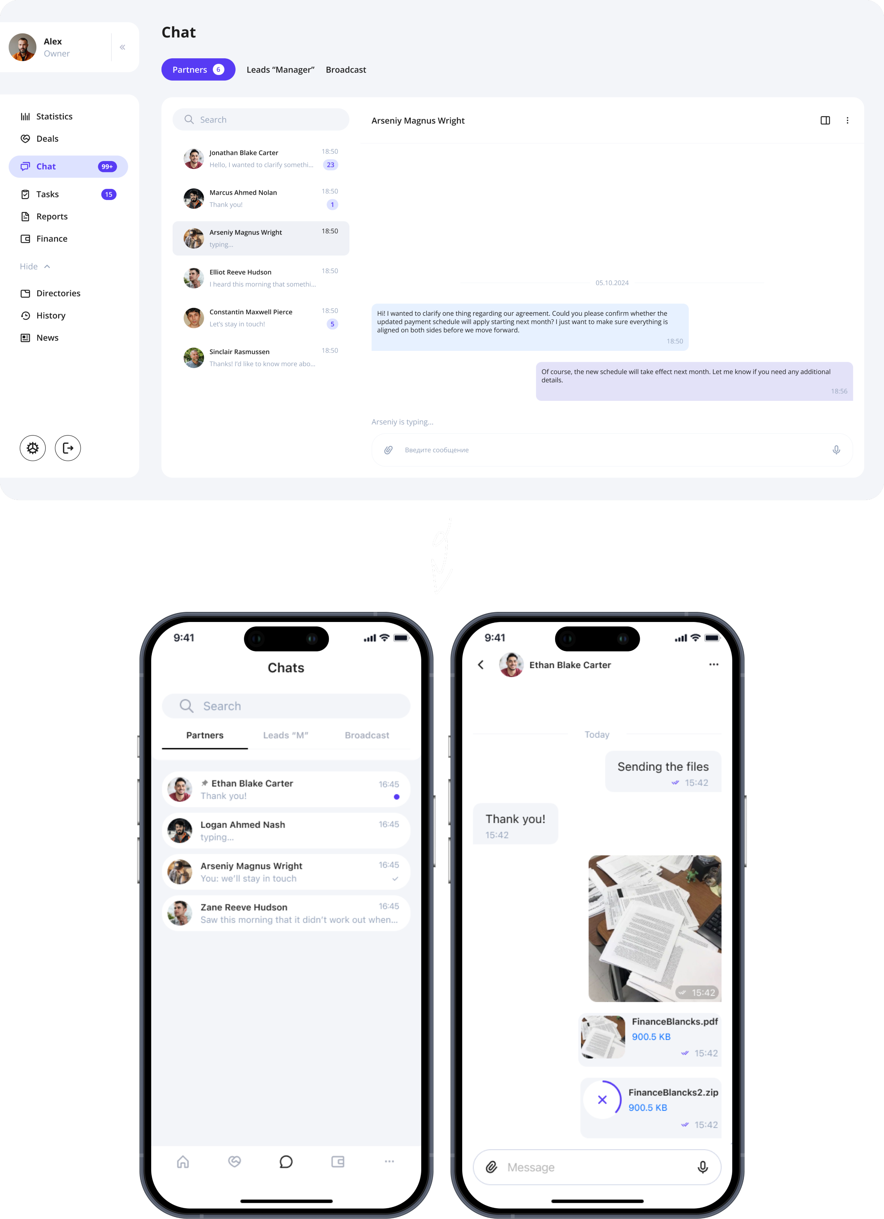
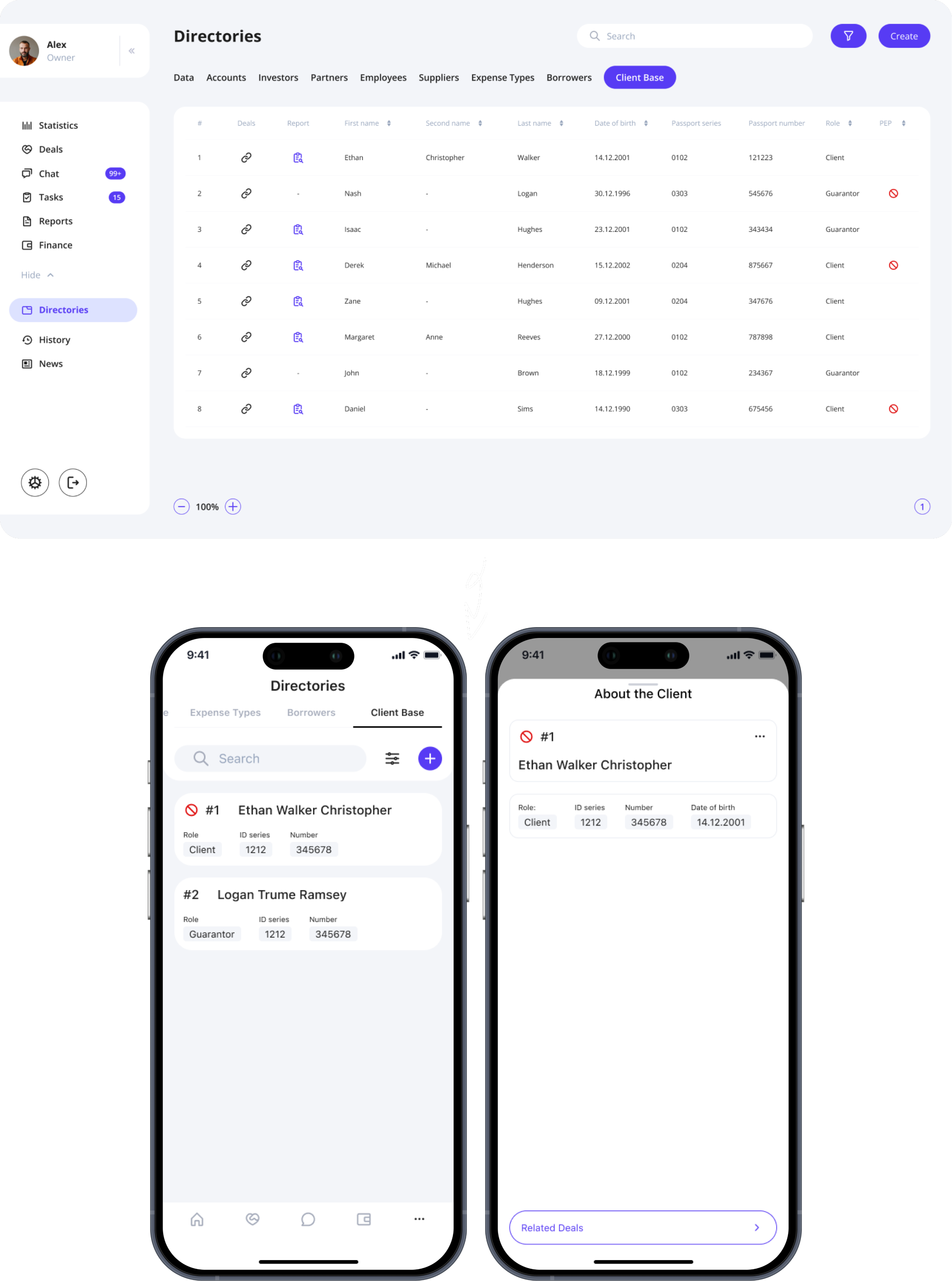
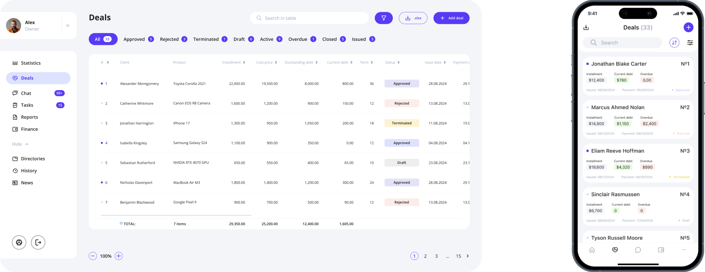
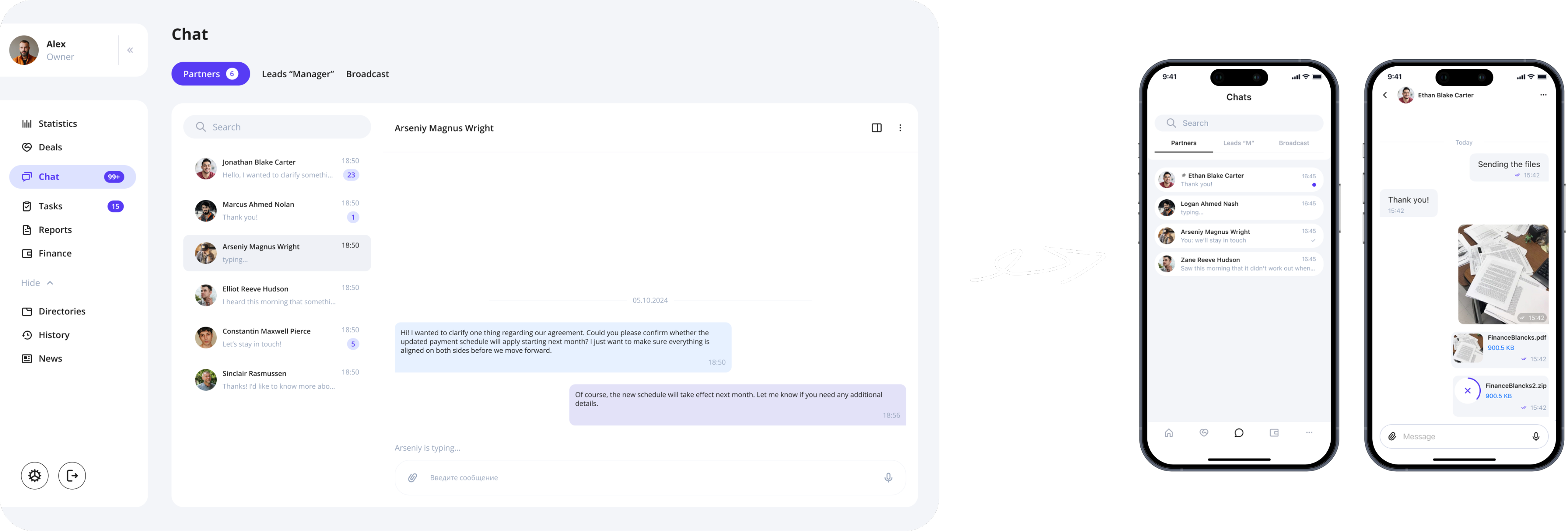
CRM → MOBILE APP

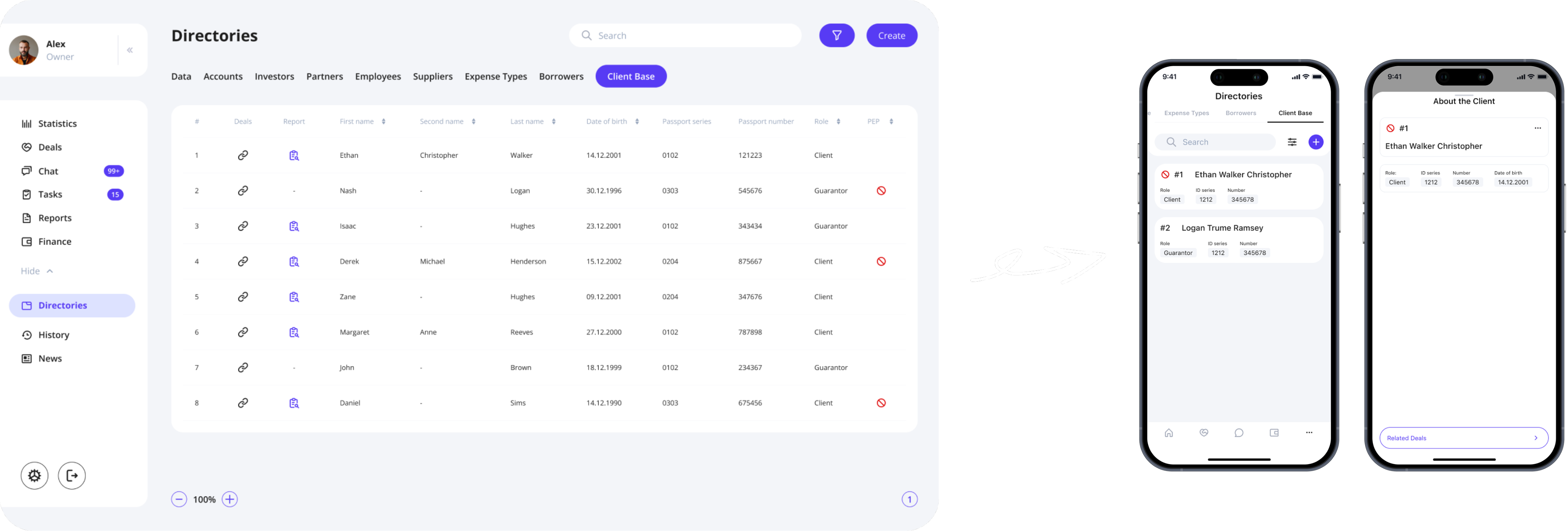
Problem
The mobile version could not be a simple shrink-down of the desktop CRM. The original system relied heavily on wide, scrollable tables—impossible to navigate on a phone without constant horizontal and vertical scrolling.
Solution
- Each table row became a card-style block, readable at a glance
- Navigation was optimized for quick access and one-handed use
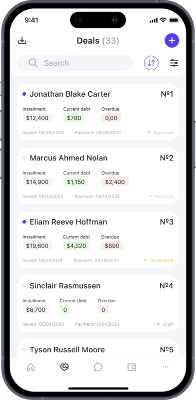
The Result
A mobile CRM that preserved full functionality without the pain of mobile tables, making the system usable for field teams and managers who rely on their phones daily.
Screens // Examples
User Feedback

"Before the redesign, managing financial records felt like a never-ending maze. We had to jump through multiple screens just to track a single transaction. Now, with the new filtering system and streamlined navigation, I can locate specific transactions within seconds. It saves me nearly 30 minutes every day, which is a game changer for managing my workload."
— Finance Specialist
"The chat module used to be a constant source of frustration. Important messages from WhatsApp would either not appear or remain marked as unread even after we opened them. The new update not only fixed these issues but also introduced a cleaner, more intuitive interface that makes it easier to keep track of ongoing conversations, especially when dealing with attached documents. I feel much more confident that nothing will slip through the cracks now."
— Sales Manager
"As a business owner, I need a clear overview of all ongoing deals and financial operations. The previous version was cluttered, and I often missed critical updates. The new dashboard design consolidates key data points and presents them in a visually organized way, making it easier to monitor team performance and spot potential issues early on. It’s exactly the clarity we needed."
— Business Owner
Outcome

Led a complete redesign of the CRM, modernizing layouts, updating user flows, simplifying table-heavy interfaces, and reducing cognitive load. Conducted in-depth user interviews that shaped hypotheses and guided systematic improvements. Transformed the original web CRM into a fully functional mobile version while preserving data structure and keeping interaction complexity low. Improved clarity through updated navigation, better hierarchy, consistent component logic, and explainable UX patterns.
Result: The CRM became a cleaner, more modern, and high-clarity financial system with a consistent structure and unified rules, which simplified daily workflows and reduced the risk of errors. The mobile adaptation enabled efficient work outside the office: heavy tables were replaced with a card-based, modular layout with clear statuses and quick actions, making key operations faster and more confident on the go.

Hope you enjoyed my portfolio —
thank you for taking the time! ❤️

Back
FinTech Company
NDA
About project
This project focused on redesigning a private enterprise CRM system used for managing financial operations, deals, reports, client records, and installment plans.
After completing the full CRM redesign, I was responsible for translating the product into a mobile application — not as a copy of the web version, but as a rethought, mobile-first tool for field employees and managers who work on the go.
The challenge: turn a large, table-heavy financial system into a clean, structured, touch-friendly mobile experience without losing functionality.
Business Goals
- Increase operational efficiency by simplifying daily flows in CRM.
- Reduce errors in finance and deal processing through clearer UI and structured steps.
- Enable mobility for managers and agents working outside the office.
Responsibilities
Benchmarking
Hypothesis building
Wireframes
UX/UI Design
Interviewed internal users
Prototyping
Target Audience

Maria, 34
Finance Manager
I work with payment schedules and installment plans every day.
If something is unclear, I risk making a financial mistake.
Michael, 45
Head of Sales
I’m constantly on the move.
I need a mobile app where I can review and approve deals quickly — without horizontal scrolling.
Emily, 38
Administrator
I manage client records, documents, and statuses every day. If screens are cluttered, it slows down everything I do.
HYPOTHESES

Working hypothesis
→ Quick access to client information
When I am in the deals table, I want to be able to open client information by clicking, so that I can quickly find the necessary information.
→ Active row improves focus
When I am using the table, I want to highlight a row (make it active by clicking) so that I don’t lose track of the data I am currently working with
→ Frequent filters speed up search
When I am looking for a specific deal in the table, I want to see frequently used filters to apply them quickly.
→ Focused sidebar reduces distraction
When I am searching for a specific section in the sidebar, I want to avoid distractions from “secondary” sections, so that I can quickly find the “main” ones.
Non-working hypothesis
When I open the main screen, I want to see a task list to quickly complete them and not miss any important tasks.
→ Task list on the main screen is unnecessary
When I click on reports or especially on references in the sidebar, I want the further items to be displayed in a more understandable view, so that I can quickly understand where I want to go next.
→ Sidebar expansion does not add clarity
CRM redesign

Problem
The original CRM suffered from visual overload: inconsistent layouts, dense tables, unclear hierarchy, and a lack of structure across financial screens.
The team needed a fresh, clean financial UI that would reduce cognitive load and bring predictability to daily workflows.
Solution
Based on interviews with existing CRM users, I identified key friction points in navigation, financial flows, and data readability.
The redesign focused on:
- lean, modern UI with clear hierarchy
- consistent patterns for deals, payments, and installment plans
- streamlined flows (fewer steps, clearer logic)
The Result
The redesign transformed the CRM into a clean, high-clarity financial system that feels modern, reliable, and truly built for professionals.
Old to New // Example

Screens // Examples
CRM → MOBILE APP

Problem
The mobile version could not be a simple shrink-down of the desktop CRM. The original system relied heavily on wide, scrollable tables—impossible to navigate on a phone without constant horizontal and vertical scrolling.
Solution
- Each table row became a card-style block, readable at a glance
- Navigation was optimized for quick access and one-handed use
The Result
A mobile CRM that preserved full functionality without the pain of mobile tables, making the system usable for field teams and managers who rely on their phones daily.
Screens // Examples
User Feedback

"Before the redesign, managing financial records felt like a never-ending maze. We had to jump through multiple screens just to track a single transaction. Now, with the new filtering system and streamlined navigation, I can locate specific transactions within seconds. It saves me nearly 30 minutes every day, which is a game changer for managing my workload."
— Finance Specialist
"The chat module used to be a constant source of frustration. Important messages from WhatsApp would either not appear or remain marked as unread even after we opened them. The new update not only fixed these issues but also introduced a cleaner, more intuitive interface that makes it easier to keep track of ongoing conversations, especially when dealing with attached documents. I feel much more confident that nothing will slip through the cracks now."
— Sales Manager
"As a business owner, I need a clear overview of all ongoing deals and financial operations. The previous version was cluttered, and I often missed critical updates. The new dashboard design consolidates key data points and presents them in a visually organized way, making it easier to monitor team performance and spot potential issues early on. It’s exactly the clarity we needed."
— Business Owner
Outcome

Led a complete redesign of the CRM, modernizing layouts, updating user flows, simplifying table-heavy interfaces, and reducing cognitive load. Conducted in-depth user interviews that shaped hypotheses and guided systematic improvements. Transformed the original web CRM into a fully functional mobile version while preserving data structure and keeping interaction complexity low. Improved clarity through updated navigation, better hierarchy, consistent component logic, and explainable UX patterns.
Result: The CRM became a cleaner, more modern, and high-clarity financial system with a consistent structure and unified rules, which simplified daily workflows and reduced the risk of errors. The mobile adaptation enabled efficient work outside the office: heavy tables were replaced with a card-based, modular layout with clear statuses and quick actions, making key operations faster and more confident on the go.

Hope you enjoyed my portfolio — thank you for taking the time! ❤️