Sportely
View Website


About project
Sportely is an end-to-end SportTech ecosystem that connects partners, trainers, administrators, and clients through a unified CRM and a mobile app.
When I joined the project, both products already existed, but required continuous UX improvements, flow optimizations, and feature expansion.
My role was to redesign outdated UX patterns, remove friction in key journeys, improve clarity across the CRM, and enhance the booking experience in the mobile app. I also created prototypes for new social features that Sportely plans to introduce in future releases.
Business Goals
- Improve operational efficiency for partners and administrators by simplifying complex flows inside the CRM.
- Re-evaluate and refine key UX flows across CRM and mobile to improve clarity, speed, and overall user experience.
- Increase engagement and retention through upcoming social features (posts, updates, activity feed).
- Enhance clarity and consistency across both CRM and mobile app to minimize errors and support daily workflows.
Responsibilities
UX/UI Design
CRM Experience Improvements
User Journey Optimization
Feature Architecture
Prototyping
Target Audience


Mark, 42
Partner
I manage schedules, events, and customers every day. I need flows that don’t slow me down — the faster I can update things, the better my business runs.

Sarah, 26
Administrator
I handle bookings, payments, and client issues. When something takes too many clicks, it affects everyone’s work. I need clarity and predictable steps.

Leo, 29
Mobile App User
I just want to quickly find a class, see the level, book a spot, and know what to expect. It should feel simple, clean, and fast.
CRM Changes

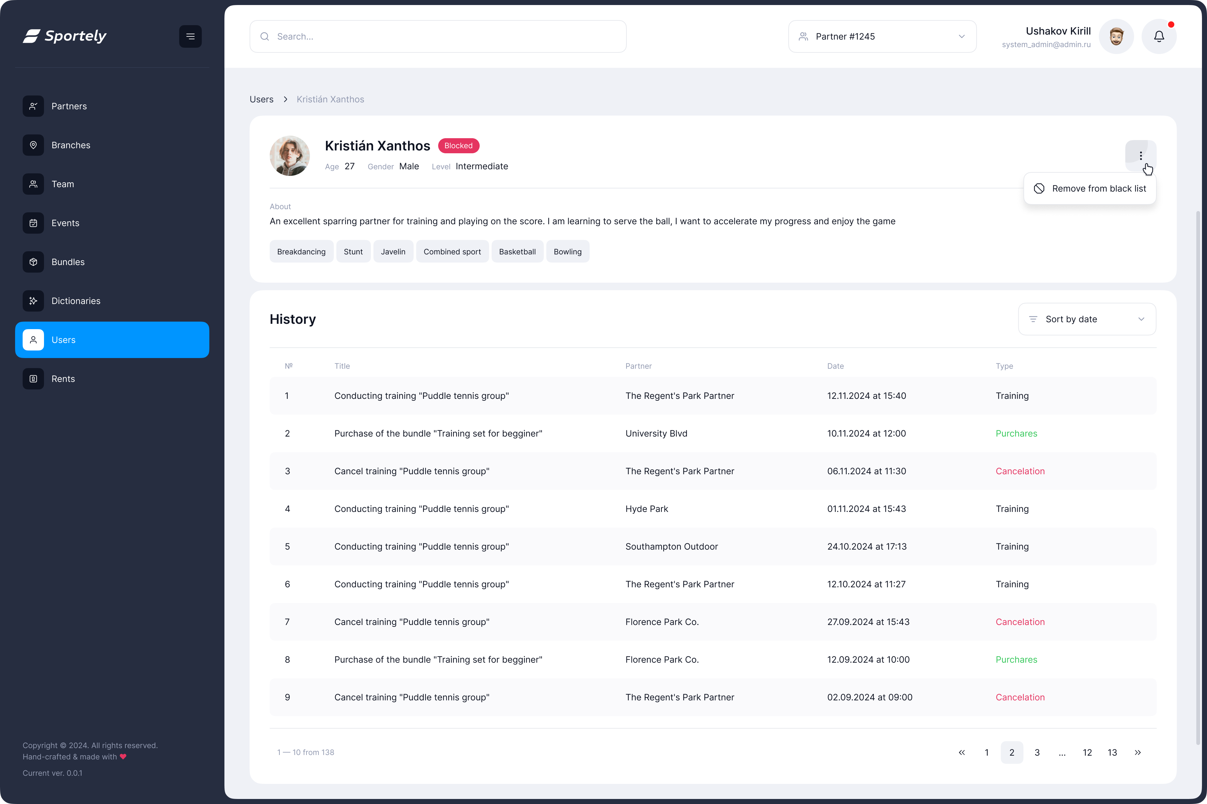
User Profile Header
Problem
The growing product requirements demanded a more informative and structured user header.
Key data such as activity, revenue, goals, communication preferences, and skill levels needed to be surfaced in a single, easy-to-read overview to support faster operational work and better decision-making.
Solution
Created a modular, well-organized header with clear information groups:
- Personal data, actions, and financial info placed in dedicated sections
- Introduced structured “Notes” (goals, preferences, communication channels)
- Skill levels shown as sport-specific badges
The Result
- Instant understanding of a client’s status
- Fewer steps to reach important details
- Better clarity for daily operations
Screens

Branch Photos
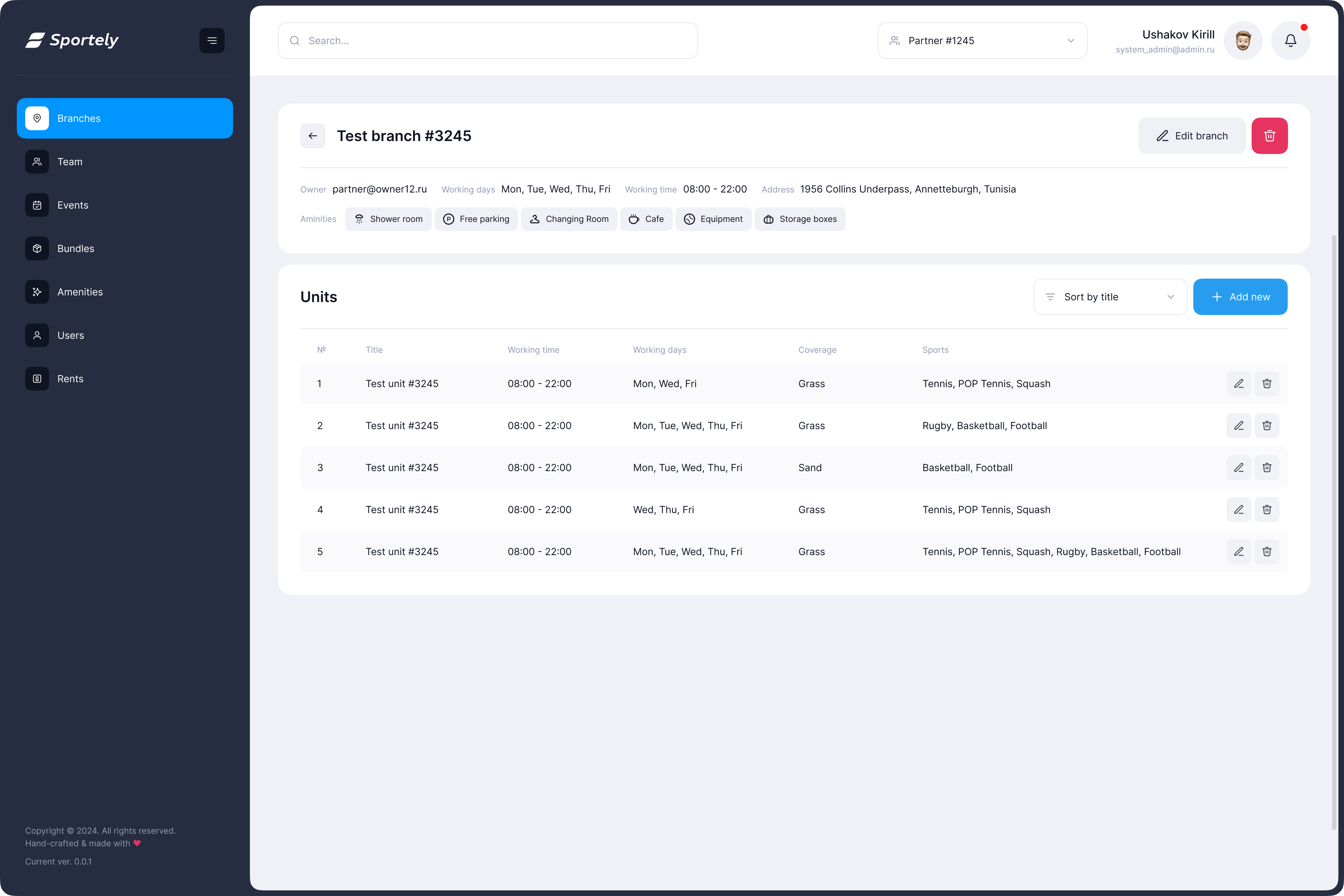
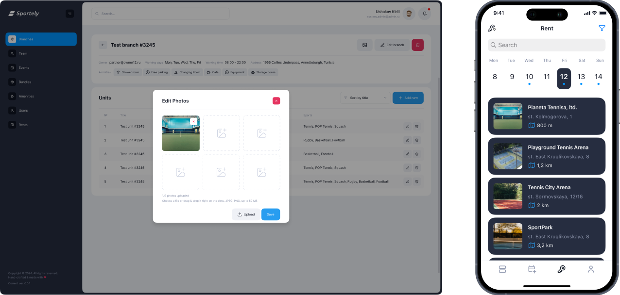
Problem
Sports venues (branches and individual units) needed a visual layer so clients could preview courts directly inside the mobile app.
The CRM did not yet support photo uploads for units, which limited how locations appeared in mobile search and reduced the ability to choose based on real visuals.
Solution
- Added a dedicated photo management module to the CRM branch view
On mobile, venue cards now display:
- Primary preview image
- Full gallery inside the venue page
The Result
- Venues became visually informative inside the app
- Clients can choose courts not only by distance and availability but also by appearance
- Partners gained a simple way to maintain visual content
- Stronger connection between CRM data and mobile experience
- Higher trust and transparency when selecting a sports location
Screens
MOBILE // examples

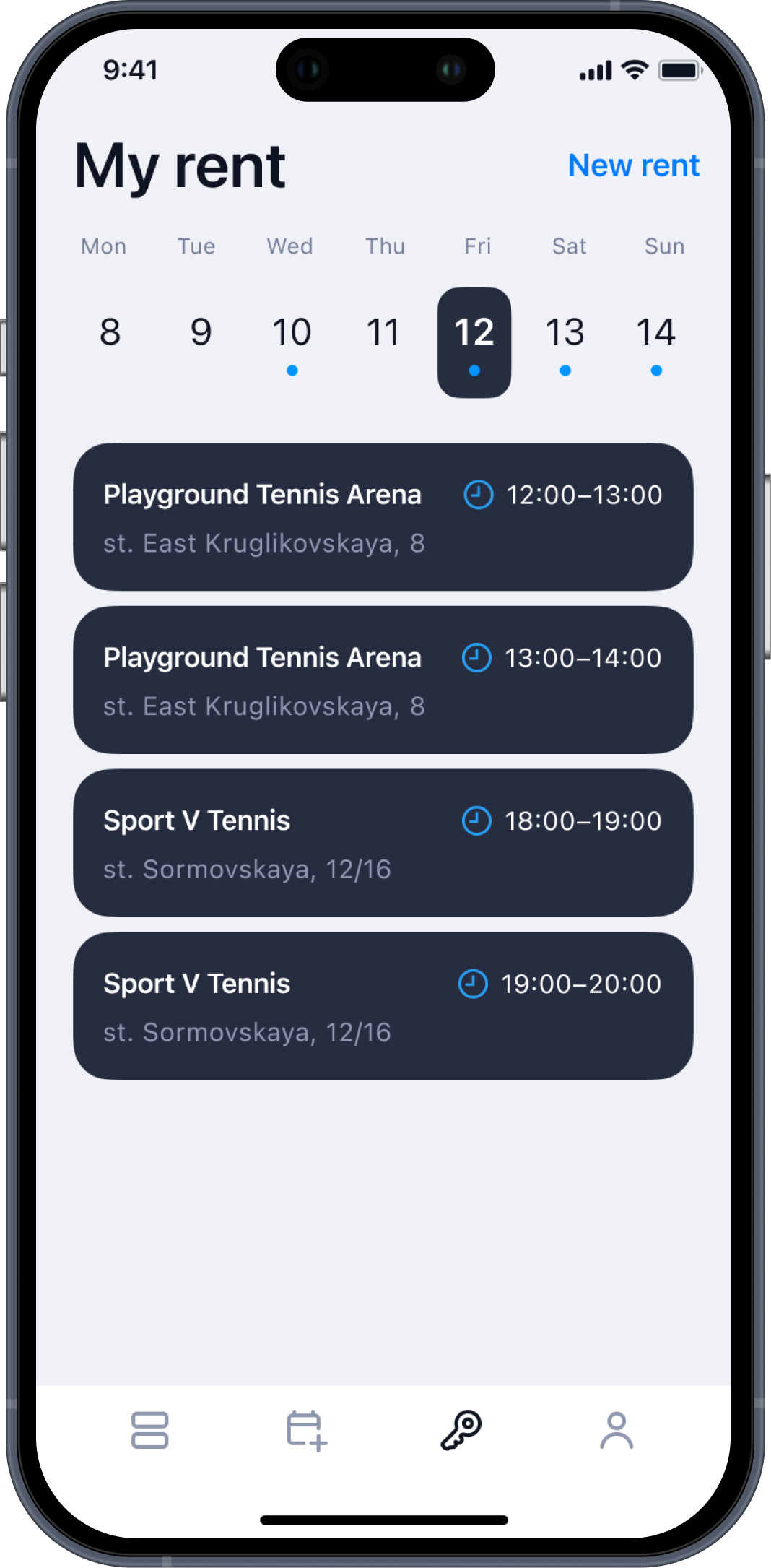
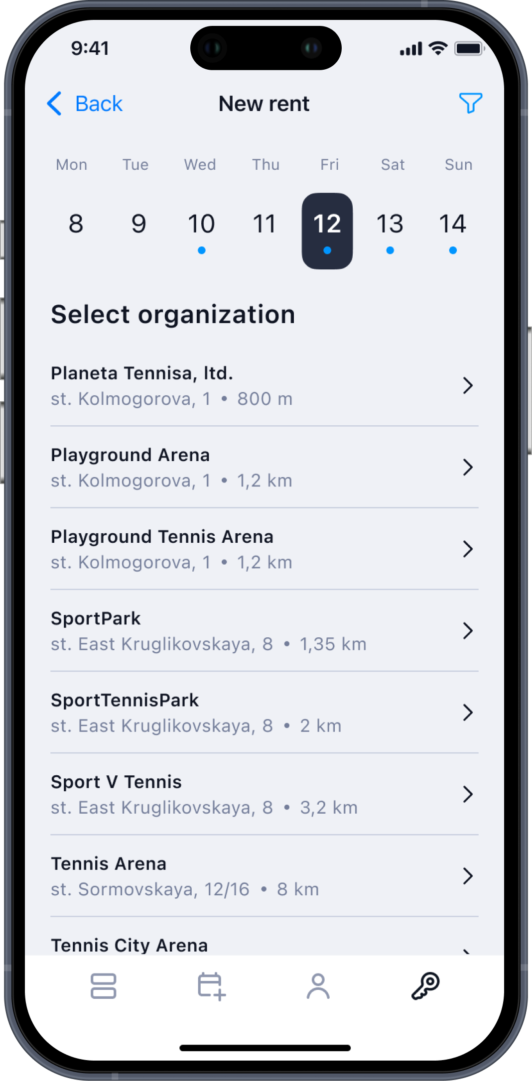
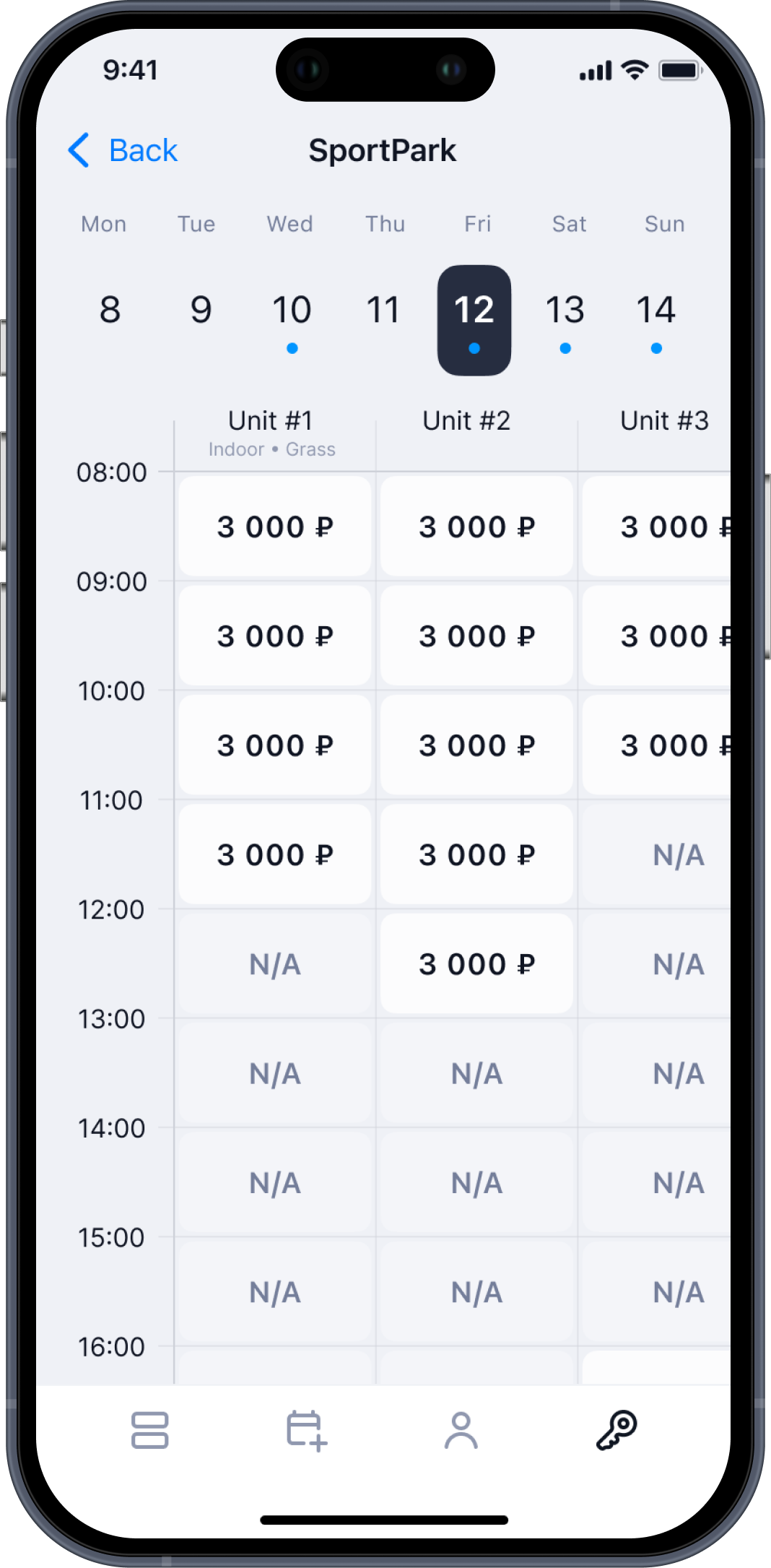
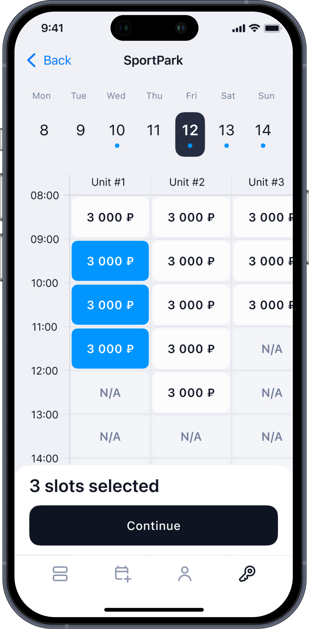
Problem
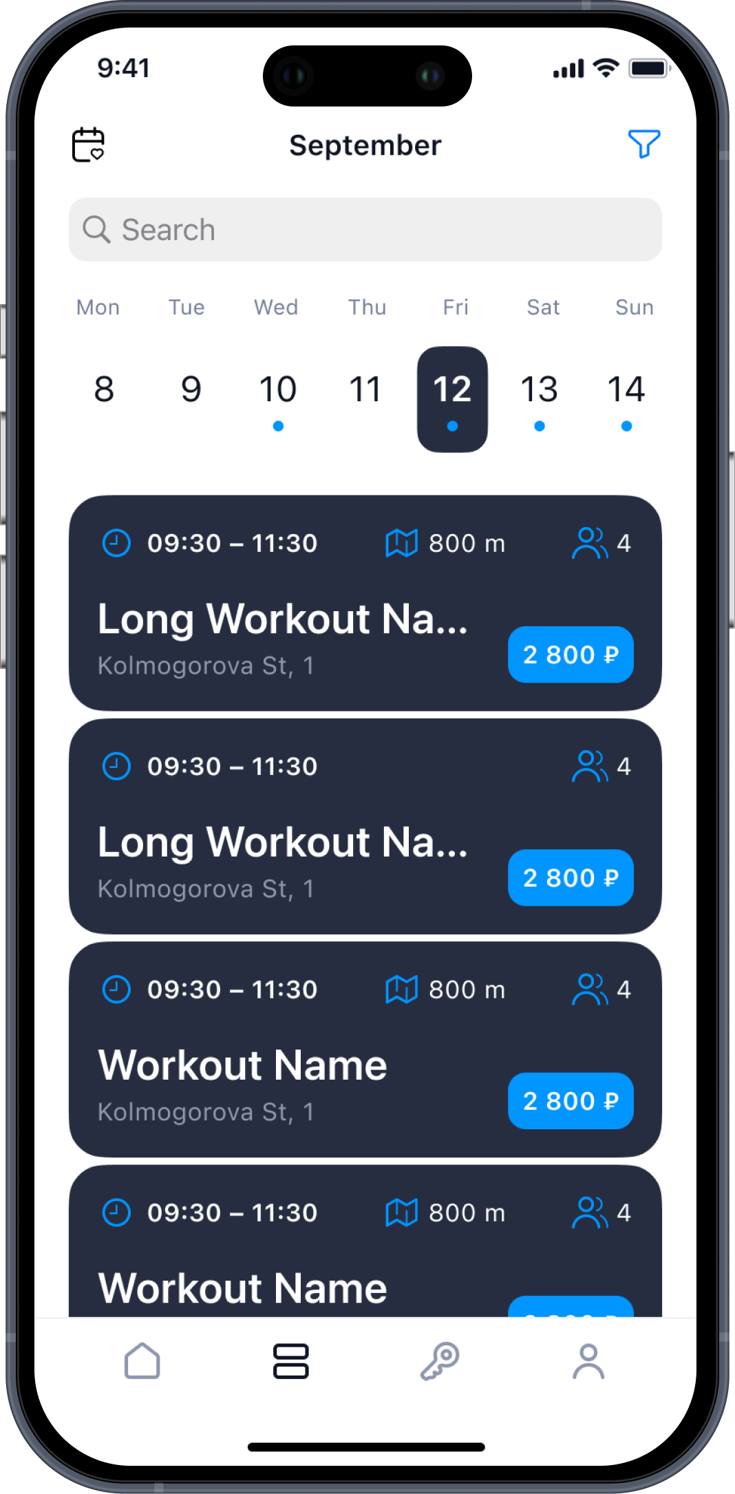
The rental flow needed to become faster and more intuitive for users who often book courts on the go.
The goal was to create a clear, linear flow.
Solution
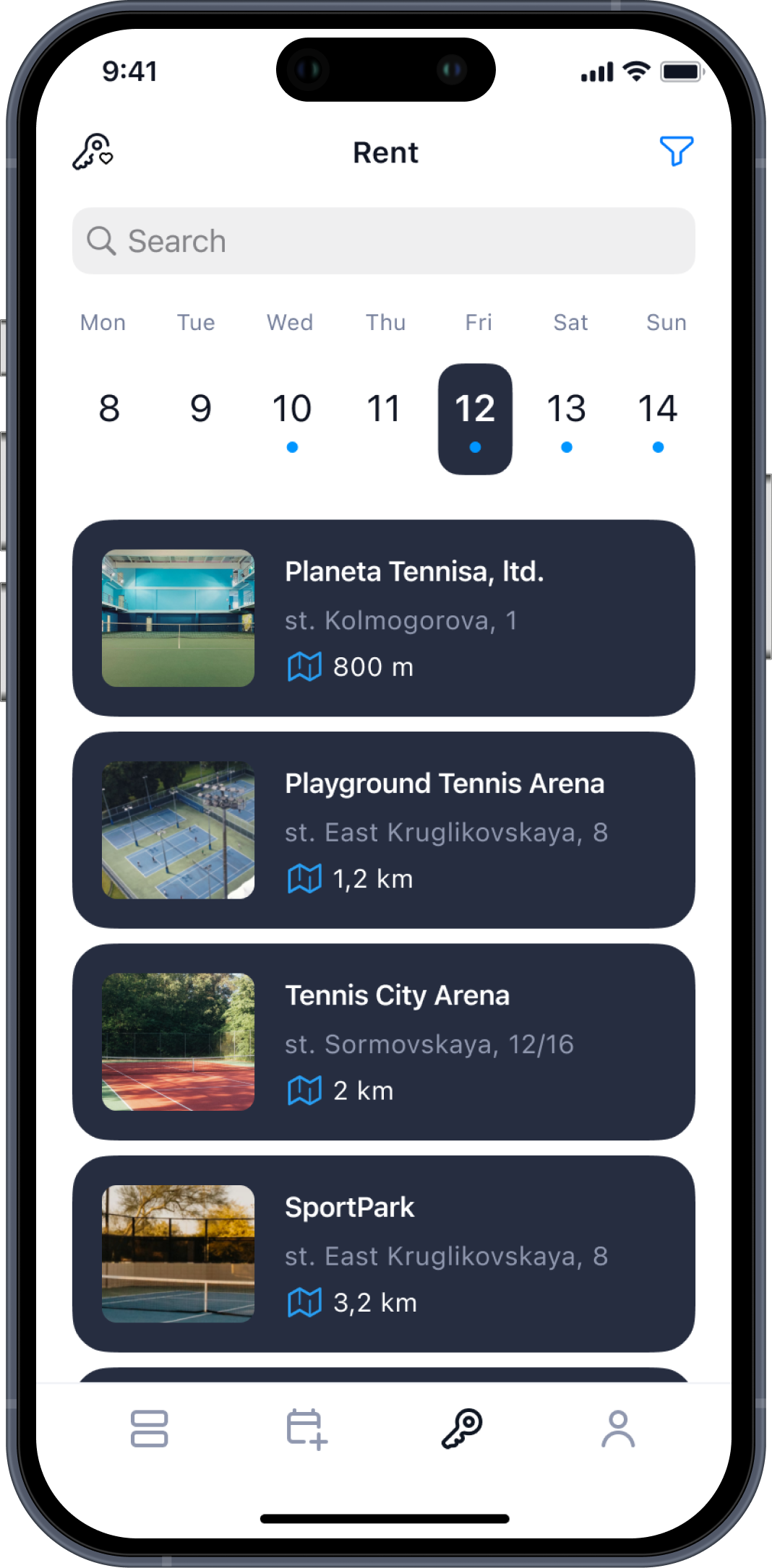
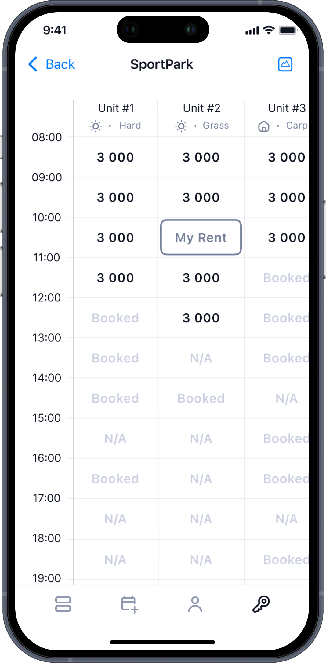
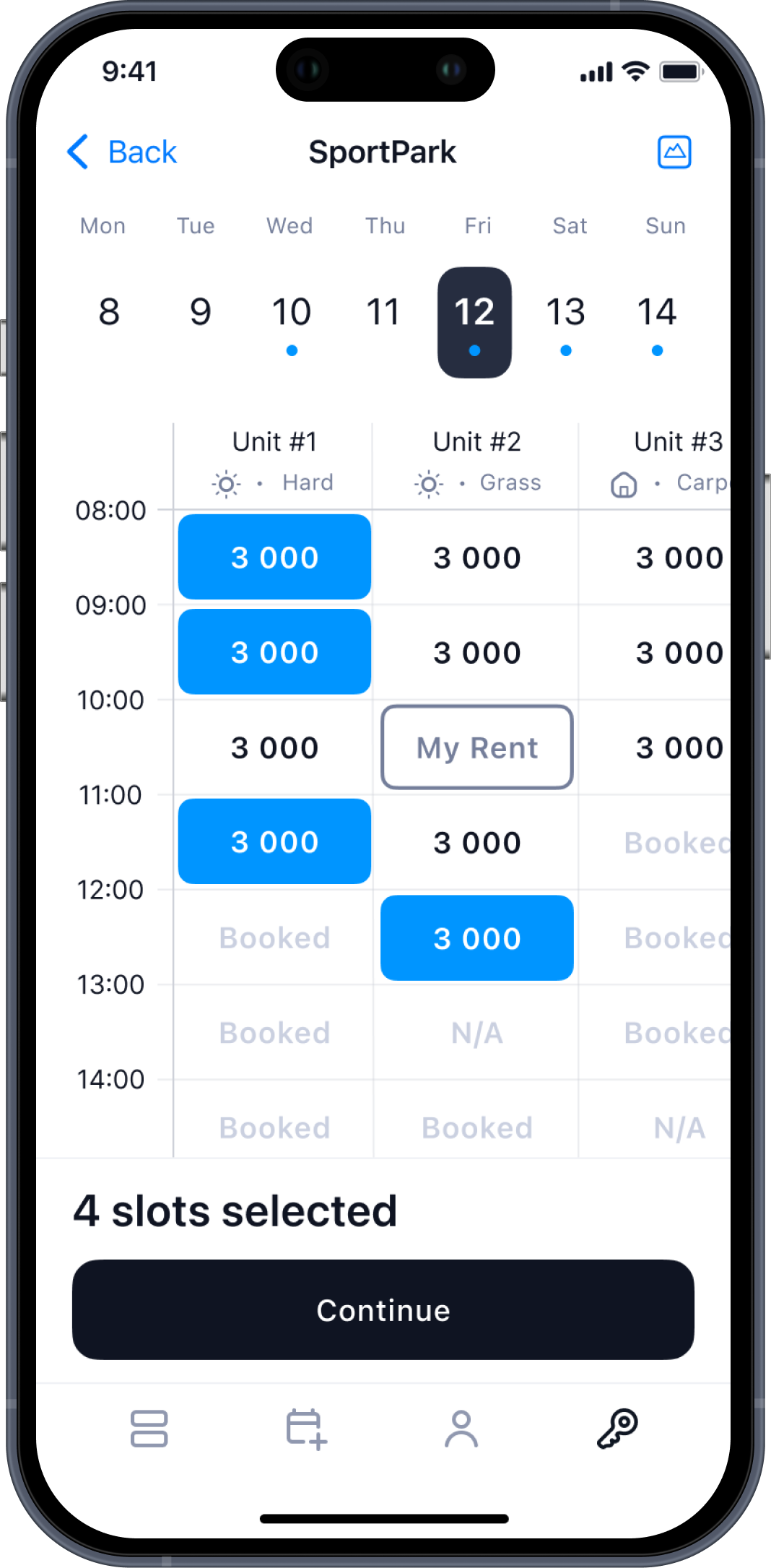
- Improved venue list with distance, photos, and key details
- Direct transition to available slots from the list of venues — without intermediate screens
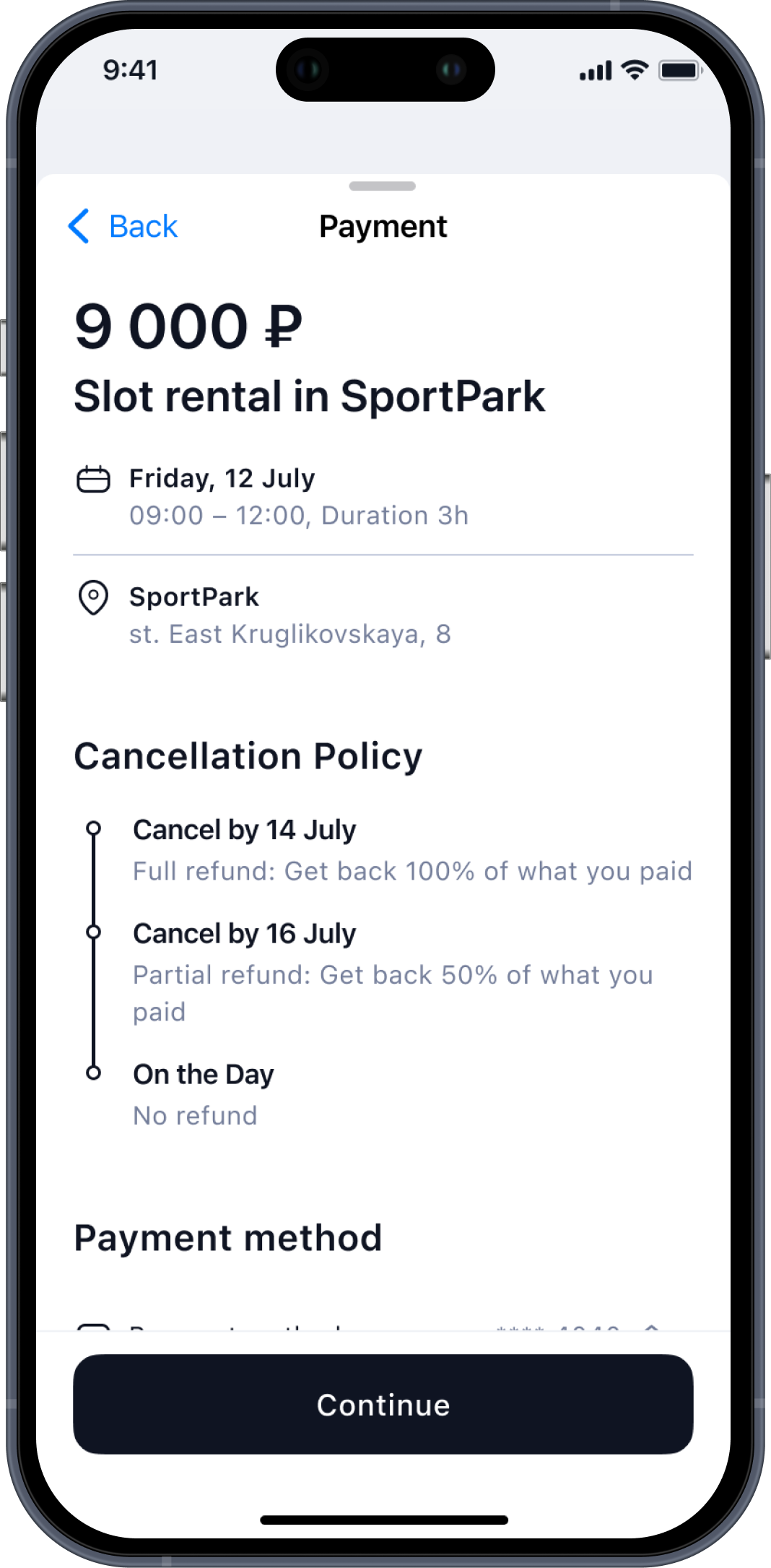
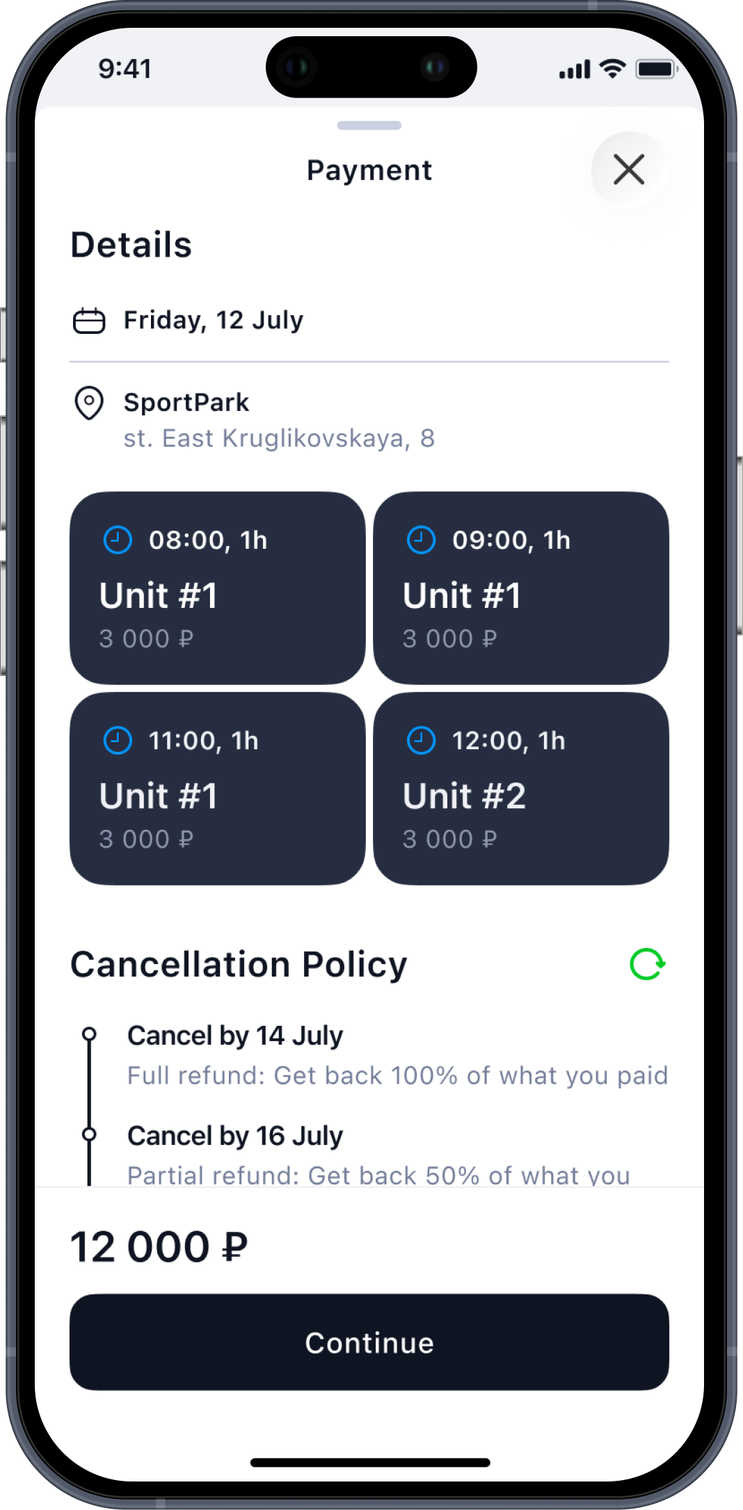
- Added block-based unit previews on the payment screen so users can quickly review what they selected before paying
The Result
- Booking now requires fewer actions and feels more intuitive
- Users reach the slot selection one tap faster
- Easier review of selected units at the payment step
Before
After // Full Flow
Outcome

The product became faster, clearer, and more scalable across use cases. Registration and login flows were simplified, cutting completion time by 50–71%, while critical user paths were optimized by reducing steps to action by 30–50% and merging overlapping sections into one intuitive flow. Within two months, these improvements helped attract 5+ new partners and expand the product beyond tennis to stretching and padel, strengthening market relevance. The updated structure also created a foundation for upcoming social features, including profiles, activity visibility, and progression signals, positioning the platform for long-term growth.

Hope you enjoyed my portfolio —
thank you for taking the time! ❤️
About project
Sportely is an end-to-end SportTech ecosystem that connects partners, trainers, administrators, and clients through a unified CRM and a mobile app.
When I joined the project, both products already existed, but required continuous UX improvements, flow optimizations, and feature expansion.
My role was to redesign outdated UX patterns, remove friction in key journeys, improve clarity across the CRM, and enhance the booking experience in the mobile app. I also created prototypes for new social features that Sportely plans to introduce in future releases.
Business Goals
- Improve operational efficiency for partners and administrators by simplifying complex flows inside the CRM.
- Re-evaluate and refine key UX flows across CRM and mobile to improve clarity, speed, and overall user experience.
- Increase engagement and retention through upcoming social features (posts, updates, activity feed).
- Enhance clarity and consistency across both CRM and mobile app to minimize errors and support daily workflows.
Responsibilities
UX/UI Design
CRM Experience Improvements
User Journey Optimization
Feature Architecture
Prototyping
Target Audience

Mark, 42
Partner
I manage schedules, events, and customers every day. I need flows that don’t slow me down — the faster I can update things, the better my business runs.
Sarah, 26
Administrator
I handle bookings, payments, and client issues. When something takes too many clicks, it affects everyone’s work. I need clarity and predictable steps.
Leo, 29
Mobile App User
I just want to quickly find a class, see the level, book a spot, and know what to expect. It should feel simple, clean, and fast.
CRM Changes // example

User Profile Header
Problem
The growing product requirements demanded a more informative and structured user header.
Key data such as activity, revenue, goals, communication preferences, and skill levels needed to be surfaced in a single, easy-to-read overview to support faster operational work and better decision-making.
Solution
Created a modular, well-organized header with clear information groups:
- Personal data, actions, and financial info placed in dedicated sections
- Introduced structured “Notes” (goals, preferences, communication channels)
- Skill levels shown as sport-specific badges
The Result
- Instant understanding of a client’s status
- Fewer steps to reach important details
- Better clarity for daily operations
Screens

Branch Photos
Problem
Sports venues (branches and individual units) needed a visual layer so clients could preview courts directly inside the mobile app.
The CRM did not yet support photo uploads for units, which limited how locations appeared in mobile search and reduced the ability to choose based on real visuals.
Solution
- Added a dedicated photo management module to the CRM branch view
On mobile, venue cards now display:
- Primary preview image
- Full gallery inside the venue page
The Result
- Venues became visually informative inside the app
- Clients can choose courts not only by distance and availability but also by appearance
- Partners gained a simple way to maintain visual content
- Stronger connection between CRM data and mobile experience
- Higher trust and transparency when selecting a sports location
Screens
MOBILE APP Changes // examples

Problem
The rental flow needed to become faster and more intuitive for users who often book courts on the go.
The goal was to create a clear, linear flow.
Solution
- Improved venue list with distance, photos, and key details
- Direct transition to available slots from the list of venues — without intermediate screens
- Added block-based unit previews on the payment screen so users can quickly review what they selected before paying
The Result
- Booking now requires fewer actions and feels more intuitive
- Users reach the slot selection one tap faster
- Easier review of selected units at the payment step
Before
After // Full Flow
Outcome

The product became faster, clearer, and more scalable across use cases. Registration and login flows were simplified, cutting completion time by 50–71%, while critical user paths were optimized by reducing steps to action by 30–50% and merging overlapping sections into one intuitive flow. Within two months, these improvements helped attract 5+ new partners and expand the product beyond tennis to stretching and padel, strengthening market relevance. The updated structure also created a foundation for upcoming social features, including profiles, activity visibility, and progression signals, positioning the platform for long-term growth.

Hope you enjoyed my portfolio — thank you for taking the time! ❤️